Helium started as a style guide in Figma. I rebuilt it so people and AI agents could build with it.
- Company
- Shiga, Enta and Pulse’s parent company
- Industry & platform
- Fintech, Web3, B2C, B2B, Web, Mobile, SaaS
- Role
- Design system owner, Figma library + production React codebase
- Team
- Product, Engineering
- Timeline
- June to October 2026 (code layer)
- Tools
 Figma,
 Claude Code, Helium React, Storybook, Style Dictionary, Chromatic
Helium is Shiga’s design system, used across Enta and Pulse. I own it end to end: the foundations, the Figma library, the production React code and the rules that tell people and AI agents how to use it.
Project TLDR:
- I wanted more than consistent screens. I wanted a code layer that AI coding agents could build with, so their work matches the design as closely as an engineer’s.
- I started with the foundations, turned them into 1,608 Figma variables with names ready for Web, iOS and Android, then built 48 components in Figma and React, linked to each other and documented in a public Storybook.
- Pulse’s first build, in July 2026, used Helium’s components and took five working days.
What I wanted Helium to do
Every design system is meant to help a team build consistently. That was the starting point for Helium too, but I had a second goal. AI coding agents were starting to write our front-end code, and left to themselves, each one invents its own colours, spacing and components. I wanted Helium to give agents a code layer to build with, so a screen comes out right whether a designer, an engineer or an agent builds it.
Helium 1.0 couldn’t do that. It was a style guide in Figma. Designers had one place for colours, type and shared components, but engineers rebuilt every screen by eye from Figma links and screenshots. Nothing tied the code back to the design, so small differences crept in, like mixed casing and a label that read “Ban account” in our send flows.
Helium 2.0 is built on Untitled UI, a widely used Figma kit. I kept that base and rebuilt everything on top of it, from the foundations up, so the same names run from Figma to code.
Starting with the foundations
Before any component, I settled the foundations every screen draws on: type, colour, size and space.
- Typefaces
- Two typefaces, each with its own job: Instrument Sans for the interface, and IBM Plex Mono as the number font for amounts, wallet addresses, transaction IDs and verification codes.Interface
Instrument Sans
- Regular 400
- Send money
- Medium 500
- Send money
- SemiBold 600
- Send money
- Bold 700
- Send money
ABCDEFGHIJKLMNOPQRSTUVWXYZ abcdefghijklmnopqrstuvwxyz 0123456789
I l 1 O 0
$ £ € ¥ ¢
Open source on Google Fonts, so it works on web, iOS and Android without licensing. One variable family covers weights from 400 to 700, enough for every level of hierarchy. It has the dollar, pound, euro and yen signs, but not the naira, cedi, bitcoin or tether signs.
Numbers, addresses and codesIBM Plex Mono
₦250,000.00
1,250.00 USD₮
0x7a3f…b91c
I l 1 O 0
$ £ € ¥ ₦ ₵ ₿ ₮
People copy and check amounts, wallet addresses, transaction IDs and verification codes character by character. Plex Mono’s serifed I, tailed l, flagged 1 and dotted zero mean nobody mistakes one for another. Every character is the same width, so amounts line up in columns, and it has the naira, cedi and bitcoin signs and the ₮ in USD₮.
- Colour
- The blue comes from Enta’s brand. One blue isn’t enough for an interface, so it’s a full ramp, with lighter and darker steps for hover, pressed, focus and text on brand. Error, warning and success have their own ramps, 13 accent ramps cover tags, avatars and charts, and separate grey ramps keep contrast right in light and dark. Text has to meet WCAG AA contrast, 4.5:1, or 3:1 for large text, and the semantic variables are tuned so that holds in each of the four themes. Colour is never the only signal either: an error also gets an icon and a message, not just red. The brand, grey and status ramps are below.Brand
- AAA 17.9625
#F5FAFF - AAA 17.5550
#EFF8FF - AAA 15.10100
#D1E9FF - AAA 13.18200
#B2DDFF - AAA 8.15300
#53B1FD - AA 5.82400
#2E90FA - AA 4.57500
#1570EF - AA 5.99600
#175CD3 - AAA 8.19700
#1849A9 - AAA 9.83800
#194185 - AAA 14.12900
#102A56 - AAA 15.81950
#0E2243
Grey- AAA 18.3925
#FCFCFD - AAA 18.0550
#F9FAFB - AAA 17.12100
#F2F4F7 - AAA 15.21200
#E4E7EC - AAA 12.79300
#D0D5DD - AAA 7.32400
#98A2B3 - AA 4.97500
#667085 - AAA 7.69600
#475467 - AAA 10.46700
#344054 - AAA 16.03800
#182230 - AAA 17.75900
#101828 - AAA 18.86950
#0C111D
Error- AAA 18.3525
#FFFBFA - AAA 17.3550
#FEF3F2 - AAA 15.63100
#FEE4E2 - AAA 13.29200
#FECDCA - AAA 9.71300
#FDA29B - AA 6.77400
#F97066 - AA 5.02500
#F04438 - AA 4.83600
#D92D20 - AA 6.57700
#B42318 - AAA 8.66800
#912018 - AAA 9.85900
#7A271A - AAA 13.94950
#55160C
Warning- AAA 18.4025
#FFFCF5 - AAA 18.0750
#FFFAEB - AAA 16.62100
#FEF0C7 - AAA 14.49200
#FEDF89 - AAA 12.19300
#FEC84B - AAA 10.25400
#FDB022 - AAA 8.04500
#F79009 - AA 5.41600
#DC6803 - AA 5.43700
#B54708 - AAA 7.52800
#93370D - AAA 9.44900
#7A2E0D - AAA 13.97950
#4E1D09
Success- AAA 18.3825
#F6FEF9 - AAA 17.8850
#ECFDF3 - AAA 16.94100
#DCFAE6 - AAA 14.25200
#AAEFC6 - AAA 11.65300
#75E0A7 - AAA 9.31400
#47CD89 - AA 6.84500
#17B26A - AA 4.83600
#079455 - AA 5.69700
#067647 - AAA 7.96800
#085D3A - AAA 9.93900
#074D31 - AAA 13.98950
#053321
Helium’s brand, grey and status ramps. Each step shows its contrast ratio and WCAG rating, so it’s clear which steps can carry text. - AAA 17.9625
- Type scale
- Eleven sizes from 12 to 72px. Text sizes from 12 to 20px handle the interface, and display sizes from 24 to 72px handle headings. Each size has its own line height, and emphasis comes from weight, not colour.
- Spacing
- An 8-point grid. Most screen sizes divide by 8, so layouts scale cleanly across screen densities on iOS and Android, and designers and engineers choose from the same short list of numbers instead of guessing. Most steps are multiples of 8; smaller 4px steps, and 2 and 6px for the tightest spots, handle the space inside components.
- Radius
- From 2px for small details to fully rounded for pills and avatars.
Turning the foundations into variables
I put every foundation into Figma variables, 1,608 of them, in three tiers. Primitives hold the raw values, like each step of the blue ramp. Semantic variables name what a value is for across the interface, like the colour of secondary text or a page background. Component variables name the part of a component they colour, like the background of a primary button. Semantic and component variables point to primitives, so a change to a primitive in Figma reaches every variable that points to it. Here’s how that works for the primary button.
- Component
Button, Hierarchy: Primary
A primary button labelled Button CTA, in Brand 600 blue.<Button hierarchy="primary">- Component variable
button-primary-bg- Web
var(--color-components-buttons-primary-button-primary-bg)- iOS
HeliumColors.components.buttons.primary.buttonPrimaryBg- Android
HeliumColors.components.buttons.primary.buttonPrimaryBg
- Individual light
- Brand 600
#175CD3 - Individual dark
- Brand 600
#175CD3 - Business light
- Neutral 900
#171717 - Business dark
- Neutral 700
#404040
- Primitive
Brand/600#175CD3
- Component variable
I used AI to test the naming and to generate the code side of each variable. 1,585 of them carry code syntax for Web, iOS and Android, and that part matters most for AI agents. When an agent reads a Helium design through Figma’s MCP server, it gets each variable’s code name, not just its hex value, so it reaches for the right token instead of hard-coding a colour. Helium’s Figma to code guide then maps those names to the library’s CSS variables. 1,298 variables are also scoped, so a radius only shows up where corners are set and a spacing value only where gaps are. The middle layer above shows the code names for the primary button’s background.
Designing themes for Individual and Business users
Enta has two types of users, Individual and Business, and each can use the app in light or dark. That gives Helium four themes. Which type of user someone is depends on the version of the app they use; light or dark follows their device or their own choice.
Individual keeps Enta’s blue. Business swaps the blue brand colours and the greys for neutrals, and uses a neutral version of the Enta logo with a Business caption. That makes it obvious which account you’re in, and gives business users a more understated, professional look. Here’s the app’s sidebar in each theme, live from Helium’s Storybook. Hover the menu, or open the account switcher.
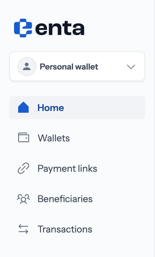
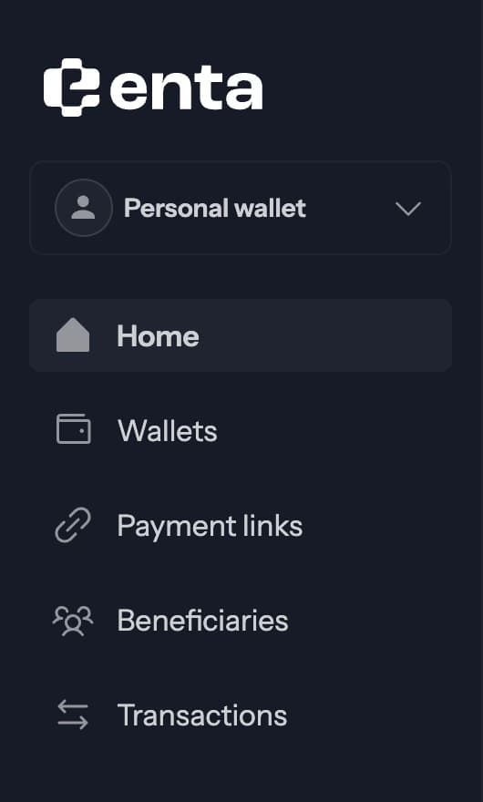
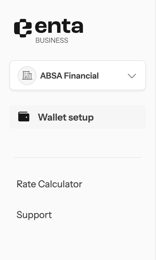
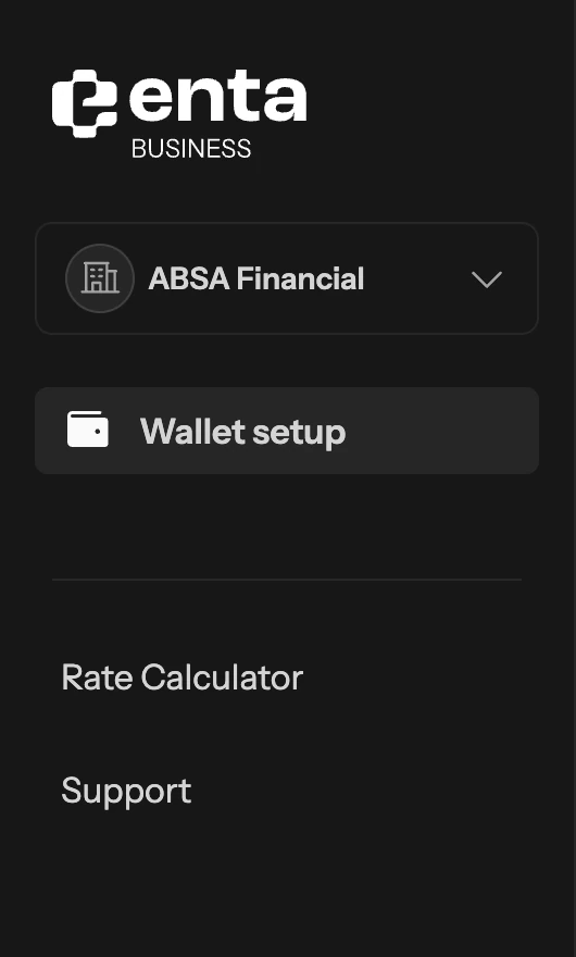
Only colour changes between themes. Spacing, type and radius stay the same, and no component checks which theme it’s in: the same 311 colour tokens simply resolve to different values. Adding a theme means adding a mode to the variables, not rewriting components. An app sets its theme with one attribute on the page:
| Theme | Users | Light or dark | Attribute |
|---|---|---|---|
| Individual light | Individual | Light | none, it’s the default |
| Individual dark | Individual | Dark | data-theme="dark" |
| Business light | Business | Light | data-theme="business-light" |
| Business dark | Business | Dark | data-theme="business-dark" |
Try it on the button from the variables section.
The same button in all four modes
Switch modes and watch the primary button go from blue in Individual to neutral in Business. An app picks the mode with one attribute on the page, shown under the preview.
<!-- Individual light is the default: no attribute -->
<html>
Helium’s Button, live from Storybook. Between modes only the variables change; the component and its props stay the same.
Building from the smallest pieces up
I organised the components the way atomic design does. Atoms are the smallest parts, like a button, an input or a badge. Molecules combine atoms, like a form field with its label, hint and error message. Organisms are complete parts of a screen, like the sidebar that frames every page of the Enta web app, or a transactions table. Here’s one of each from the Figma library.
I didn’t build all 48 at once. I started with what every Enta screen needs: buttons, form fields, tabs and the app shell. Then Helium grew with the product. Pulse needed tables, statuses and pagination. Enta’s money flows needed components a generic kit doesn’t have: a swap card for what you send and what arrives, a token avatar that shows a coin with its network, a wallet card with balances you can hide, and a timeline for transaction and approval history.
Asset sets exported from Figma keep prototypes moving too: 519 currency icons, 235 flags, 99 company logos, 39 payment methods and 232 integration logos.
Showing assets, networks and conversions
In a crypto wallet, a coin on its own isn’t enough information. USD₮ exists on several networks, and sending it on the wrong one can mean losing it. So Helium pairs icons in two ways, each with its own job.
An asset on its network
TokenAvatar shows an asset with the network it lives on. The network sits as a small badge in the bottom-right corner, and the coin is cut away around it, so the badge reads as a separate token rather than an overlap. Everything scales with the avatar’s size. Here are a few, with and without a network:
- USD₮ on Optimism
- USDC on Base
- ETH on Arbitrum
- BTC


- 20px
- 32px
- 48px
- 64px
One currency into another
Conversions need a different picture, because nothing is sitting on anything. Helium draws them as one coin split on a diagonal: the currency you start with on one side, the one you end up with on the other. The same style covers every direction a payment can go: a currency into an asset, an asset into a currency, one currency into another, or one asset into another. Helium ships 22 of these pairs as ready-made art.
- GBP → USDC
- USD₮ → NGN
- EUR → GBP
- USDC → USD₮


Connecting Figma to code
Each component went from Figma to React the same way. An AI coding agent read the component in Figma and built it in React, using Helium’s tokens and never a raw value. Figma’s properties became the component’s props, so a designer’s “Hierarchy: Primary” is an engineer’s hierarchy="primary". I checked every component against Figma in the browser before it counted as done. Here’s the path every component takes.
Figma component
Variables and properties, such as Hierarchy: Primary.
AI coding agent
Reads the design through Figma’s MCP server, with each variable’s code name.
AGENTS.md: reuse components, use tokens.
React component
Built with Helium’s tokens. Figma properties become props.
My review
Checked against Figma in the browser before it counts as done.
Link file and manifest
Records the Figma node and how each property maps to a prop.
Storybook
Docs, all four modes and the Figma design beside the code. Chromatic checks every story, and each Figma component links back to its Storybook page.
Our Figma plan doesn’t include Code Connect, so I built the link myself. Each component has a small file that records its Figma node and how its properties map to props, and a script gathers them into one manifest. Each Figma component also links back to its Storybook page, so the connection works in both directions. Here’s Button’s file.
{
  "component": "Button",
  "figma": {
    "fileKey": "6JDUb53AbMLtIJPanHJUfP",
    "nodeId": "3287:427074",
    …
  },
  "propMap": {
    "hierarchy": {
      "figmaProperty": "Hierarchy",
      "values": {
        "Primary": "primary",
        "Secondary": "secondary",
        …
      }
    },
    "size": {
      "figmaProperty": "Size",
      "values": { "sm": "sm", "md": "md", "lg": "lg", … }
    },
    …
  },
  "status": "linked"
}Storybook is where everything gets checked. All 48 components are documented there with more than 300 stories, a switch for the four modes and the Figma design beside the code. Chromatic captures every story in every mode, so a change to a token can’t quietly break a theme. Here’s Button’s page.
For agents, the rules live in AGENTS.md: reuse a Helium component before writing new markup, use tokens instead of raw values, and look up how Figma maps to code in the manifest. Agents read it every time they work in the repo. These are the rules as agents read them.
- **Look before you build.** Find the Figma node and the existing component
  (§7) before writing markup. Reuse a public component rather than restyling
  one. Don't invent what Figma doesn't have.
…
- Use only `--helium-*` tokens and component-local custom properties. No hex. Use raw px only for off-scale Figma measurements, and comment each one.
…
- **Look it up first.** Before building any UI, find the Figma node in `docs/figma-to-code.md` or `figma-manifest.json`, and use the existing component in place of new markup.Designing how components behave
Consistent looks aren’t enough if components behave differently from screen to screen. I wrote 13 UX patterns that set how things work, and six decision records that explain the harder calls, so nobody has to reopen them.
- Forms
- Primary buttons stay clickable. When something is missing, tapping the button shows exactly what and where, right under the field, instead of a greyed-out button that gives no reason. The error clears as soon as the person edits the field, and what they typed stays if they go back. Try it below.Live from Helium’s StorybookView in Storybook
The form error state in all four modes
Loading Individual light…<!-- Individual light is the default: no attribute --> <html>Helium’s Input error states, live from Storybook: the red border, the message under the field and the error focus ring.
- Loading
- Skeletons for content that’s on its way. Spinners only for transactions the person is waiting to confirm.
- Menus
- Clicking outside or pressing Escape closes them, and only one is open at a time.
- Navigation
- Back retraces the person’s steps. Close returns them to the start of the section.
- Focus
- One 2px focus ring across every component, for people using a keyboard.
- Motion
- Toasts animate in over 300ms, stay for 3.5 seconds, leave over 700ms, and can be swiped away early.
Writing the words into the system
Words are part of the interface, so they’re part of Helium too. Every error message follows one formula: say what happened, then how to fix it. I rewrote more than 100 messages across sign-up, verification and payments. The first draft read like a policy document:
| Before | After |
|---|---|
| “Password must comprise a minimum of 8 characters.” | “Password must be at least 8 characters.” |
| “Kindly rectify the errors indicated above prior to proceeding.” | “Some fields have errors. Fix them to continue.” |
| “This email is already registered. Kindly log in or utilize an alternative email address.” | “This email may already be registered. Log in or reset your password.”Note: Doesn’t confirm whether an account exists. |
| “Payment Order Not Found” | “Payment session has expired. Go back and start again.”Note: No internal system terms in front of users. |
Who uses Helium
- Pulse
- Pulse’s console imports Helium’s React components, icons and tokens directly, and its embedded checkout follows Helium with a few local changes. The first build took five working days in July 2026.
Read the Pulse case study - Enta prototypes
- The onboarding and multisig prototypes use built copies of Helium instead of styling their own controls.
- Mobile engineering
- The mobile team is bringing Helium’s tokens and core components into the Enta app.
- Design tools
- Helium is set up in Claude Design for the team, and I removed the makeshift copies people had made.
- AI coding agents
- Every agent working in a Helium-based repo starts from AGENTS.md and the manifest.
How I keep Helium reliable
I built the code layer with Claude Code. I owned the foundations, the Figma library, the decisions, the reviews and the QA. The agent wrote code to rules I set, and nothing counted as done until I had checked it against Figma in the browser.
Two reviewers audited the library and found 198 issues, 7 of them critical. I fixed 139 in one pass; the rest were resolved, turned down with a reason, or logged as product decisions.
Chromatic checks every story in all four modes, and a list of settled decisions keeps the system steady as it grows.
Work in progress
Helium is still growing. Here’s what I’m working on now, and what comes next:
Finish native themingIn progress
iOS and Android get the core tokens and the light theme. Dark and Business modes come next.
Add automated testsNext
Today, quality depends on type checks, the audit and visual snapshots. Component tests would catch behaviour bugs earlier.
Retest muted text contrastNext
A few muted text colours fall below 4.5:1 in some modes. We kept them as a shared decision; I’d test them with users and fix them in the tokens.
Move the error copy into HeliumNext
The message library lives in a spreadsheet. As a UX pattern in the repo, it would sit next to the components that use it.
Publish the packagesNext
Products use local copies of Helium today. A private package registry would make each update a simple version bump.