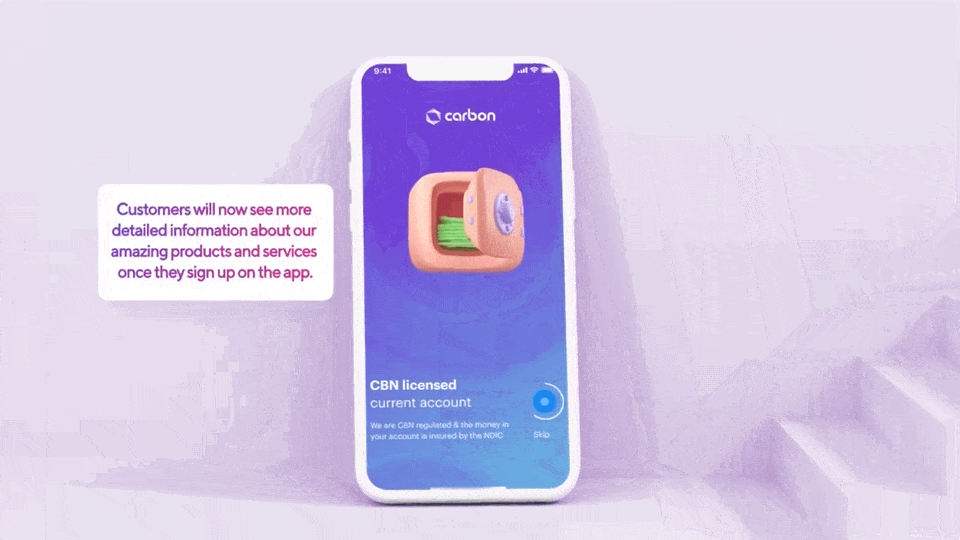
Customers saw two different versions of Carbon, depending on their phone.
- Company
- Carbon
Visit Carbon - Industry
- Fintech, B2C banking
- Role
- Product Designer
User research - Team
- 1 product manager
3 product designers
6 engineers
1 product marketer
1 QA engineer - Period
- February 2023 · 4 weeks
Carbon is a credit-led digital bank in Nigeria with more than four million customers. Its services span loans, payments, investments and personal money management.
Impact TLDR:
- I contributed product design and user research as part of the three-designer team.
- The release brought Android and iOS together through a shared design system and a clearer home screen.
- Recorded team outcomes included an 81% increase in customer satisfaction, a 25% increase in registrations and 10% dormant-account reactivation.
What customers needed from the home screen
The home screen was crowded, and its hierarchy made the loan product harder to find. Data analysis identified credit as customers’ most important need, but the interface did not give it a clear enough place.
Support tickets and app-store reviews exposed another problem: customers asked whether Carbon had two different applications. Android and iOS looked and behaved differently, so changing phones also meant learning a different interface.
Discovery brought together user interviews, competitive analysis and literature review to understand those needs. The design priorities became clearer access to credit, a familiar experience on either platform and more control over visible balances.
One experience, two platforms
The redesign used Carbon’s Hydrogen Design System to bring the two platforms into one visual language. The information architecture put credit and everyday banking actions into clearer, more consistent locations.
Three decisions shaped the direction
- Give credit a dedicated home
- A persistent Loans tab grouped loan applications, loan history and credit education. Cards moved into Quick Access alongside other everyday actions.
- Make the interface familiar on either phone
- Shared typography, icons and components replaced the separate Android and iOS treatments.
- Let customers choose what others can see
- Balance hiding extended across account, loan and savings views. Hiding the account balance also concealed transaction figures.
Exploration and usability testing
Four explorations compared different arrangements of the balance area, credit entry points, Quick Access and transaction history. They show the hierarchy choices behind the final interface.
A Loans tab still needed to be noticed
The archived usability conclusions show that participants found loans through the cards but overlooked the bottom tab. Moving a feature into persistent navigation did not, by itself, make that route visible enough.
The notes also raised concerns about trust, USSD access and referrals. Those findings broadened the conversation beyond the visual redesign to how customers understood and recommended Carbon.
The redesigned home screen
The final experience brings the balance, money actions, credit offers, Quick Access and transactions into a shared hierarchy. Customers can hide sensitive figures while keeping their everyday actions available.
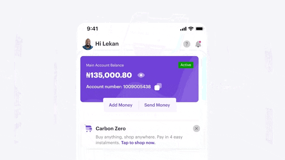
Engineering handoff and implementation QA
Comparing production with the prototype made implementation details visible. The review annotated balance visibility when returning from Savings, button padding and text alignment, completed-transaction history and the orientation of the Account icon.
The in-app announcement explained the changes in terms of customers’ existing habits: choose what stays hidden, find Cards in Quick Access and use Loans in the bottom navigation. It made the new information architecture visible during the transition.
Results and recognition
The project recorded increases in customer satisfaction and registrations, alongside dormant-account reactivation. These are outcomes of the team’s release.
- 81%
- Increase in customer satisfaction
- 25%
- Increase in user registrations
- 10%
- Dormant accounts reactivated during the release month
Captured release feedback includes customers recognising the design team and asking for further features, including dark mode and a referral link.
“I'm really proud of what the @get_carbon team are delivering and this new design change of the Carbon app is just one of the many new changes that are coming. Our mission is not just to change the way you bank, but change your life by banking with us!”
What I learned
Listen before the public release
Customer conversations help test whether a simpler screen is also easier to use. The overlooked Loans tab is a reminder to check how people find a feature, even when its location seems clear in the design.
Trust is part of everyday interaction
Balance privacy and a familiar interface matter alongside access to banking features. A cleaner visual system supports that experience, while customer feedback reveals the concerns the interface alone cannot address.